
Style an app is simple
- Begin by adding a "Profile Image" and/or "Header Image" (Optional)
- Add a background image instead of, or in addition to a color background.
- Optionally add a Title and Bio/Description.
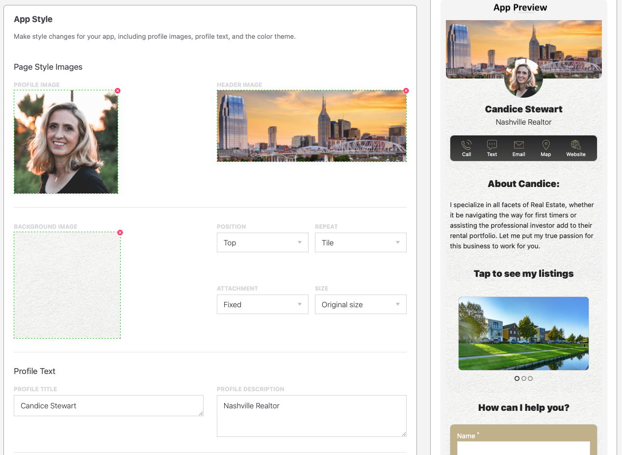
Note regarding the background image: These images are not optimized so very large images (e.g. 2+ Mb) can slow your app. The example above uses a small photo of a textured stone that is tiled across the screen to produce a nice background effect with minimal data load.
The background image controls are as follows:
Position: Positions the image at the top, center, or bottom of the app. A top position can create a banner effect.
Repeat: Repeats the image horizontally, vertically, or both, which means it is tiled in both directions.
Attachment: Controls whether the content will Scroll with the background or in front of a Fixed background.
Size: Keeps the images in its original size, stretches it to the nearest screen edge, or stretches it to cover all content, including off-screen content.
Tip: An optimal balance balanace between background image size and effect is to use the default setttings and a background image sized for a mobile screen (e.g. 640 pixels wide X 960 pixels tall). Mobile devices will be covered, while desktop customers will see three of the images repeated across the screen.
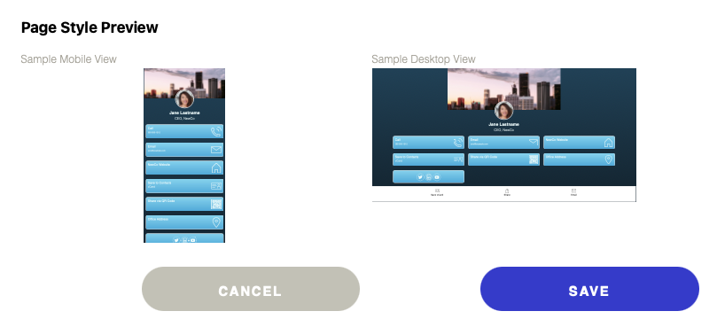
Navigation Bar
A Navigation Bar (Nav Bar) appears at the top of an app to speed navigation and to provide convenient access to key functions.
Select the color scheme and chooses whether to display an image, an install button, share button, the Push notification button, or a Hamburger menu. If one adds a Hamburger menu, select it here in the Style Tab. A Hamburger menu that is always present on the page is handled differently than other Actions.
Color, Fonts, and Page Layout
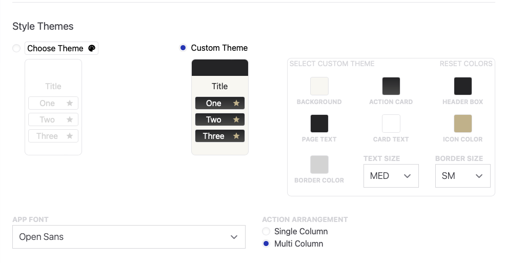
- Next, add color. The easiest way is to choose a color-coordinated template.
- If you do not like any of the templates, choose one that is close and edit the colors you want to change.
- You can also reset to default and let your inner designer go wild with a custom theme. Individually control the background color, the button/card color, the icon color, the text colors, and the border color. Be sure and try different patterned gradients.
- Choose the default size of text and the border weight.
- Choose your preferred Font
- Finally, select how you want your content ot display on larger screens (i.e. desktop and tablet) -- in a single column, or in multiple columns.
Comments
0 comments
Please sign in to leave a comment.