
A Carousel Action allows one to add a set of actions that automatically cycle through a position on a page. Optionally the carousel can with link directly to the then visible Acton or to a subpage of all the actions in the Carousel.
The Carousel attributes that can be controlled are:
- Title (optional)
- Background and text color
- Transition interval time (in seconds)
- Transition mode
- Slide - Slide transition that also allows the carousel to be advanced via a swipe.
- Fade - This mode disolves one image and replaces it with the next
- Destination Mode
- Direct - Tapping the visible Action will trigger it. If a Link action is in the carousel, then tapping it will visit the link
- Subpage - Treats the carousel like a subpage such that tapping any Action will display a subpage with all of the Actions in the carousel.
the background color of the Carousel window, the optional title text and color, the transition interval, and whether the transition is a slide or fade.
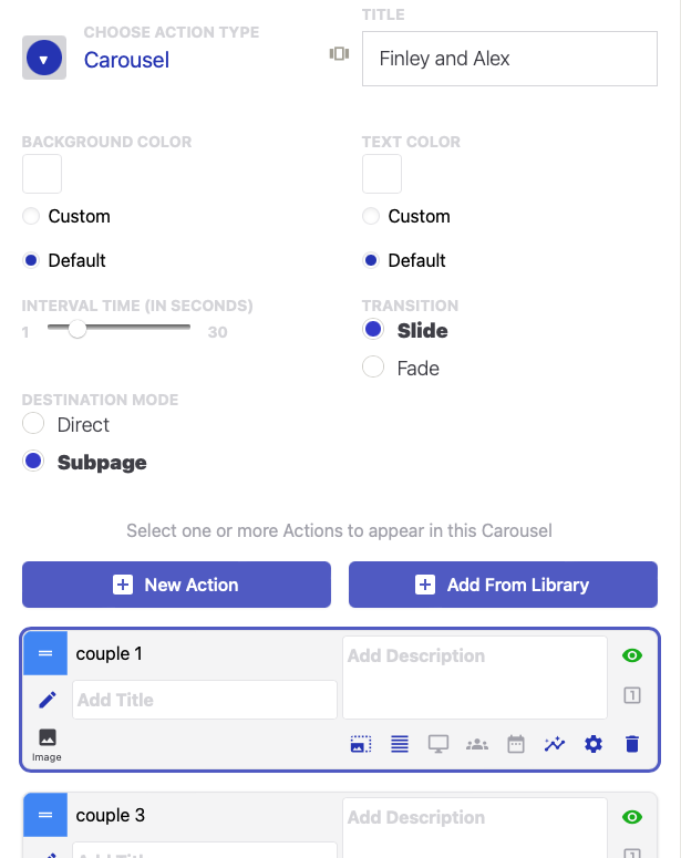
As with the main page of an app or a Subpage, you can create new Actions in the Carousel editor, or you can add existing Actions from the Library.
Reference the Action Formatting and Controls FAQ for a refresher on the controls that are common to Actions.
Comments
0 comments
Please sign in to leave a comment.