
Once created, you have to option of editing an Action though its Main Edit Page or through its Quick Edit Module.
Main Edit Page Quick Edit Module
Main Edit Page
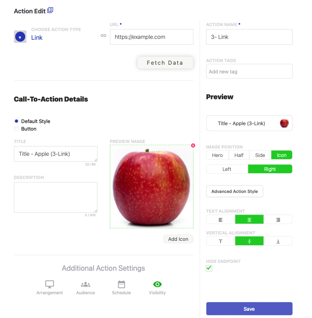
Actions have a wide selection of options and controls. As you open each Action, you will see the first see the controls that are unique to that Action, followed by the controls that are common to Actions.
For example, a Link Action will have a field for a destination URL, while a vCard Action will have multiple fields for the information standard to a user's contact profile, including a profile photo, telephone numbers, email addresses, maps, etc.
Actions also have common control options. For example any Action can be scheduled to appear only during a specified or recurring period and/or it may be set to only display to users with Android Phones.
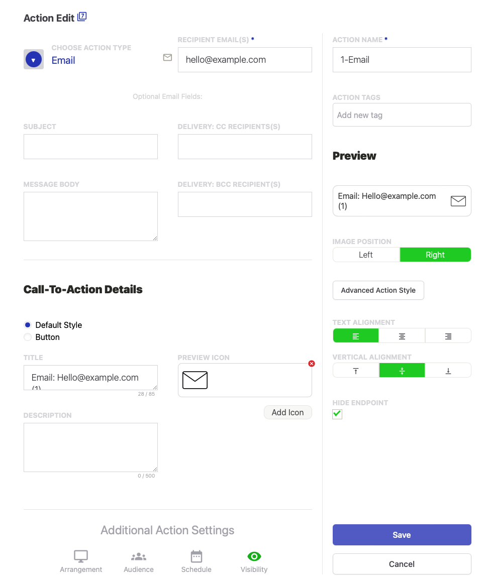
Below is an example of the Edit page for an Email Action.
Note: You see in the upper left that this Action is used in 5 different Apps or Subpages.
On this sample Edit page, you control the data specific to sending an email, including:
- the email data necessary to create the email, including
- the destination email address
- the email subject
- the message body
- any cc and/or bcc recipients
You also control elements common to most Actions, including:
- the call-to-action that incentivizes the user to tap
- the default call-to-action is a combination of Title, Description,and Image
- the optional call-to-action is a Button
- the display format of the default call-to-action includes the
- Image size and position
- text justification
- Advanced Action Styling if you want different coloring or to remove the action border
- the Additional Action Settings, which include:
- the arrangement positioning on a desktop or tablet view
- the Audience that will see the Action, (e.g., mobile vs. desktop or Androis vs. Apple, etc.)
- the Schedule for when users will see the Action
- the visibility control to temporarly hide an Action.
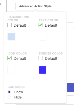
Advanced Action Style
Because Actions may be shared between apps, they are designed to mirror the color style of the app they are in. This ensures Actions in an app have consistent styling and allows them to fit seamlessly into different apps.
This color styling may be overriden with the "Advanced Action Style" option, where one can specifically select the background, text, icon, and border colors for the Action.
One can also select to show or hide the Action's container (i.e. border), which is particularly useful for Image, Menu, and Social Actions.
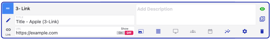
Quick Edit Module
The Quick Edit Module lets you make common changes to an Action or to access the full edit page.
Here's a quick summary of the Quick Edit Module Functions:
- Drag handle to reorder Actions. It is color-coded to announce how the Action is formatted for Desktop.
- App name. Use it to find the app in the Library. Change it from the main edit page.
- Enabling the "Data tab" caused the action to pull its endpoint from the app's database
- Add or update the call-to-action description
- Change the app's visibility to hide or display it.
- Access the Full Edit Page
- Add or update the call-to-action title
- See whether the Action is used in more than one app
- Identifies the Action type. Change the Action type from the main edit page.
- Change the Action endpoint, and choose if it should display automatically.
- Add or update an call-to-action image or icon. Also change the image position.
- Format the call-to-action text
- Update the desktop formatting
- Update the audience control
- Add or update the Action's schedule
- View the Action's metrics. Note that each instance of an Action will capture metrics.
- Selector to add tags, clone the Action, or view its preview
- Remove the Action from this App position, but leave it in the Library and in other locations.
Comments
0 comments
Please sign in to leave a comment.