
A Form Action allows one to create a form that is displayed directly on page or after a call-to-action. The form inputs can be immediatelly emailed to one or more designated email addresses, sent to an integrated webhook endpoint, sent to an integrated API, or captured in a Google Sheet.
Important capabilities:
- forms will work offline and will automatically send the form fill data when online
- a form can capture the user's precise location. See Geolocation element.
- a form can link to a new action upon competition (e.g. fill out form for white paper)
- A form can output directly to a Google Sheet. See form integrations.
- Access to Forms can be passcode controlled.
To implement security on a form, check the "Secure" option, use a call-to-action, enable App mode security from the [Security] tab.
Because you choose the number and type of fields, you can build an unlimited range of forms, including contact forms, applications, testimonial requests, whitepaper request, registrations, real estate lead forms, employment applications, and more. There are several templates available. A good way to build a form is to choose a template that is near to what you want and then add, subtract, or change fields until you have the perfect form.
Important note on privacy- Computer bots are a problem with forms. If they find your form online, they can send you thousands of false responses. Most forms use "CAPTCHA" to protect from bots, which can work in background so people do not have to verify photos, which is great. The issue is that Captcha is a Google product that collects detailed information on your visitors with tracking cookies. Due to the privacy issues, we do not use Captcha, but instead use a proprietary solution that does not rely on tracking cookies or collect your customer's information. One element of this solution is an option to lock the form for a period of 10 min. or 24 hours. If your app is not visible to search engines (SEO option "on'), then there is likely no need to use the form lock.
The available field types are:
- Text Field - Alphanumeric input field with a user-defined field name
- Email Field - Field for email addresses with a user-defined field name
- Phone # Field - Field for telephone numbers with a user-defined field name
- Checkbox - An opt-in or opt-out field where the user checks a box to affirm the associated text, which may also include links such as to a privacy policy.
- Choice - Create multiple choice, checklist, or survey questions. Optionally allow multiple answers or only a single answer. Present the options as a list or as a "drop-down-selector."
- File Upload - A button to allow one to take a photo, upload photos from the library, or upload files. One can optionally select to allow only a single file/photo or multiple. Uploaded files are optionally stored at a secure URL that may only be accessed by a user logged into the account. That URL is sent to the email address designated in the File upload setup.
- Geolocation - A hidden field that will ask the user to access their precise location when the form is submitted. (An example use would be an entry form where the user must be present to win)
- Message - A text field with a large format input box, such as might be used for support input or for a testimonial.
- Rating - A rating or review element with optional views, including a 1-10 selector, a 5 star selector, or a thumbs up/down selector.
- Rich Text - A static Text option allows one to add rich text as a header, footer, or for directional content mid form.
- Time/Date - Adds a date selector, a time selector, or a date and time selector.
- Time Stamp - A hidden field that will automatically add a time stamp of when a form-fill was submitted
- App ID - A hidden field that will automatically add the ID of the originating app. This allows the same form to be used in multiple apps, while identifying the specific app for each form-fill.
- Action Name - A hidden field that identifies the name of the Action. This is useful when there is more than one form in an app.
- Hidden - A hidden field that allows information not included in the visible form to passed to a CRM or API.
Elements have a "required" option, which means that the element is required in order to submit the form.
Elements may be rearranged with the drag handle or edited at any time.
There is a toggle on the form builder to Show/Hide hidden elements:
Form Settings
The "Form Setting" button allows one to control:
- the color scheme for the form,
- whether the form is an embed or displays after a call-to-action
- whether one returns to the page after submission or links to another Action, such as a reward for completing the form.
- whether the form is locked from use for a period as a defense against unauthorized submissions by BOTS.
- Whether the form container is hidden. If shown, the form can match the color scheme of the Actions in the app or have its own color scheme. If hidden, the form will use the background color of the app.
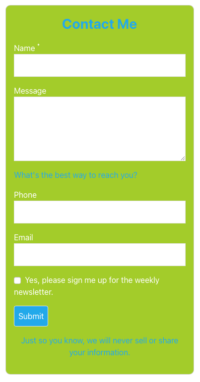
Below is an example contact form that uses descriptive text in the title, mid-form and in a footer (in blue), a large message field, background and button coloring, as well as text, phone, email, and checkbox fields.
One can link a form to another action to use a form as a gateway to premimum content. For example, one would link a Contact form to a File action and require a user to complete the form to get a whitepaper.
Integrations
Use the "Form Integrations" button to add additional destination email addresses, a webhook endpoint, an API integration, or to integrate with a Google Sheet. Reference the article on integrations in this section.
If you choose Google Sheets, you will have the option of entering a name to create a new sheet, or to pick an existing sheet in your account. You will have to authorize permission to access your Google Account. The request will come from phy.net, which is the platform domain.
*Be sure and add the destination email address to which the form data will be sent if you do not use another integration.
Or check the"Pull from Data Tab"option to cause the Action to pull the email address from the app's database, located in the app's Data tab.
Element Edit Buttons
Form elements also have edit buttons that open a rich text editor for the Field Label and for any options unique to an element.
When exporting form data, many APIs will require specific field names. If you want the "Export Field Name" to be different from the visible "Field Label" then you also have a switch that opens an option to define the Export Field Name.
Often APIs will not accept fields that are not expected, such as the text title or directions in your form. There is a switch to "Suppress Field for Exports" in such instances.
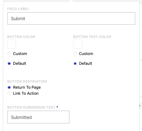
Submit Button
The submit button has several unique options. You can:
- define the text in the button
- set the button color
- set the button text color
- set the message that they user will see after submission
- AND, choose if you will return the user to their previous page after submission or if a form-fill will serve as a gateway to another Action such as a premium subpage or a file download.
Offline use
Form-fills will be sent automatically on the next visit to the app or digital card after a connection is established.
Reference the Action Formatting and Controls FAQ for a refresher on the controls that are common to Actions.
Comments
0 comments
Please sign in to leave a comment.